Wednesday, April 17, 2013

in progress.... for the final i will have two manipulated photoshop "paintings" of my roommate and myself. These are both originally paintings that I have manipulated with photoshop layers and with actual photographs to create a sense of uniformity between the two images.


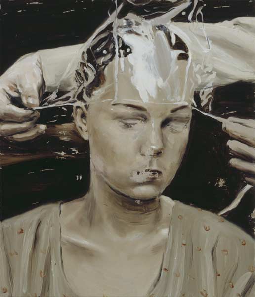
 In the images above, I blended a photograph of a friend with a painted portrait of another friend, to create visual juxtaposition between the media and subjects of the two portraits. This is my first attempt and I want to continue to experiment with blending different types of figurative representations.. while the piece is not nearly resolved, what I do like is the the surreal blending between photograph and painterly stroke, especially as shown in the facial features and the clarity of the figure's eyes. To achieve what I have done here, I pulled elements from the original photograph–hair strands, eyes, and mouth–and repositioned these details on top of the painted work.. I am interested in how I can push this further and I need to work on the background and also try working with a few different images.
Add caption
Shown above are two surreal figurative paintings by Michael Borremans-- a Belgian artist who influences my own painting.
I am interested in creating a digitally manipulated portrait that is in a surrealist style and has the figurative, almost creepy air that are so striking to me in Michael Borremans work..
the last image shown here is by Hungarian artist Noell S. Oszvald, here is a link to see more work by  Noell S. Osvald.

For my final work, I am interested in composing different images of human bodies to create one "hybrid" human form from many.


Tuesday, April 9, 2013

thanks for the feedback, I made some adjustments with blending modes and tried to create more of a focus to the piece... I had trouble trying to rearrange the boat, although I do agree with several you in saying that its orientation is a little odd. I added the footprints to hint that instead of walking towards the dream-like space, someone is walking away from it. not sure I'm crazy about them, but maybe it helps to direct the narrative and also to justify the boat's direction? i dunno:/

Tuesday, February 5, 2013

I've made a few minor adjustments since the last post––I feathered out the shadows and steam to minimize rough edges and also added a few cast shadows to create more of a spatial environment. The last thing I would be interested in doing, would be to add a swatch of newspaper print to the cover of the newspaper. I've played around with this but haven't been pleased with the results, so I may leave it as is for now.

Monday, February 4, 2013


 I am happy with the progression of this image. I think that the compositional changes of this piece and the addition of key elements––the coffee cup, newspaper, and the steam are working to help unite the piece and make my concept more visually sound.

Thursday, January 31, 2013

In my most recent development of this piece, I have departed from the more abstracted, flat design of the pneumatic tubes/french press composition posted earlier and am now trying to create more of a space and environment out of the composition. I've placed a coffee cup and a newspaper in the foreground and am playing around with text on the newspaper, though none of this is resolved at this point. To play with perspective and to recall the original imagery I was working with, I am developing the pneumatic tubes receding into the background and eventually, these delivery tubes will turn into french presses as they had in my earlier work. I think that with this process and development I am creating more of an understandable space, but am still working to incorporate the same visual elements of line, shadow, and repetition of pattern that I had in more earlier piece.

Tuesday, January 29, 2013

making..progress. continuing to learn and work with the Illustrator tools and beginning to see a composition form through my imagery. I think I like the confusing space and the repetition of patterns created here, but I need to figure out what objects are really central to the concept/composition and which might be superfluous. 

Monday, January 28, 2013

Continuing to develop and add definition to the images. Working with vectors and with gradient fill. Adding layers and trying to push and pull different aspects of the composition so that the french press imagery is prominent yet integrated.

Sunday, January 27, 2013

I
In this image I am working with a combination of two images––an image of a pneumatic postal tube and an image of a classic french press. I am intrigued by the visual similarities between the two forms and am beginning to see a way in which the two can be integrated visually and metaphorically.
To further develop this composition, I plan to multiply variations on the french press image and compose them so that they themselves become the pneumatic tubes. The french presses will vary––one with a lid fully pressed down, another partway, and another without a lid and with a newspaper rolled up inside, to symbolize the ritualistic nature of coffee, the daily press, and traditionally, of postal documents.

Wednesday, January 23, 2013

This is my first attempt at creating an image on Illustrator. In this image I was working with the image of a chicken and that of a toaster oven and was attempting to combine them to represent a commentary on fast food.